New York,
New York,

I’m a product designer working where brand and design systems meet.

I’m a product designer working where brand and design systems meet.

Currently studying Design, AI and IXD @ Pratt Institute, NY.
Previously @Nike

Currently studying Design, AI and IXD @ Pratt Institute, NY.
Previously @Nike

Currently studying Design, AI, and IXD @ Pratt Institute, NY. Previously @Nike

Nike Back to Sport campaign artwork featuring the Go Back Better visual system.

Overview

Nike Back to Sport: a brand identity that invites everyone back to movement.

Back to Sport is one of Nike’s biggest buying moments of the year. I led the brand system for the Summer 2024 campaign, adapting Nike’s global direction into a distinct North American expression while staying unmistakably Nike.

The goal was to create one cohesive “Go Back Better” brand moment that could flex across every touchpoint, from Nike.com and the app to email and integrated media.

Role

Brand & Visual Design

Deliverables

  • Campaign Toolkit: System of reusable assets, components, and patterns for geo activation.

  • Execution Playbook: Single source of truth for internal and external partners, showing how to translate the toolkit into channel- and market-right executions.

The Toolkit

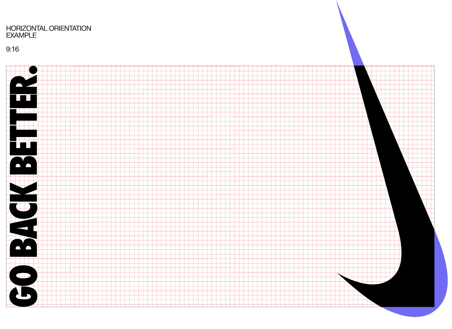
I built a flexible set of visual assets and design elements that formed the foundation of the Back to Sport campaign. From lockups and typography to color, composition, and imagery, each element was designed to work together across different formats and content needs.

Overview of the Nike Back to Sport brand-system guidelines.

↳ COloR

The color system was built around two core color directions: Power Orange, rooted in Nike’s established visual identity, and Power Blue, introduced for North America to create a distinct pairing for the moment.

Color extended beyond the graphic system into photography. I developed guidelines for how the two directions could work with both campaign photography and existing product imagery, creating a consistent visual relationship across different types of content.

The color system was built around two core color directions: Power Orange, rooted in Nike’s established visual identity, and Power Blue, introduced for North America to create a distinct pairing for the moment.

Color extended beyond the graphic system into photography. I developed guidelines for how the two directions could work with both campaign photography and existing product imagery, creating a consistent visual relationship across different types of content.

Color theme selection guide: pull the palette from the product, or from the tone and temperature of the photography

↳ Lockup System

I defined how the lockup could scale and be positioned across different touchpoints. Placement and proportions were informed by Nike’s Podium design system, creating consistency across formats while allowing each surface to work within its own constraints.

Nike Back to Sport lockup construction guide, example one.
Final Nike Back to Sport lockup, example one.
Nike Back to Sport lockup construction guide, example two.
Final Nike Back to Sport lockup, example two.
Nike Back to Sport lockup construction guide, example three.
Final Nike Back to Sport lockup, example three.
Nike Back to Sport lockup construction guide, example one.
Final Nike Back to Sport lockup, example one.
Nike Back to Sport lockup construction guide, example two.
Final Nike Back to Sport lockup, example two.

↳ Lockup System

I defined how the lockup could scale and be positioned across different touchpoints. Placement and proportions were informed by Nike’s Podium design system, creating consistency across formats while allowing each surface to work within its own constraints.

Nike Back to Sport lockup construction guide, example three.
Final Nike Back to Sport lockup, example three.
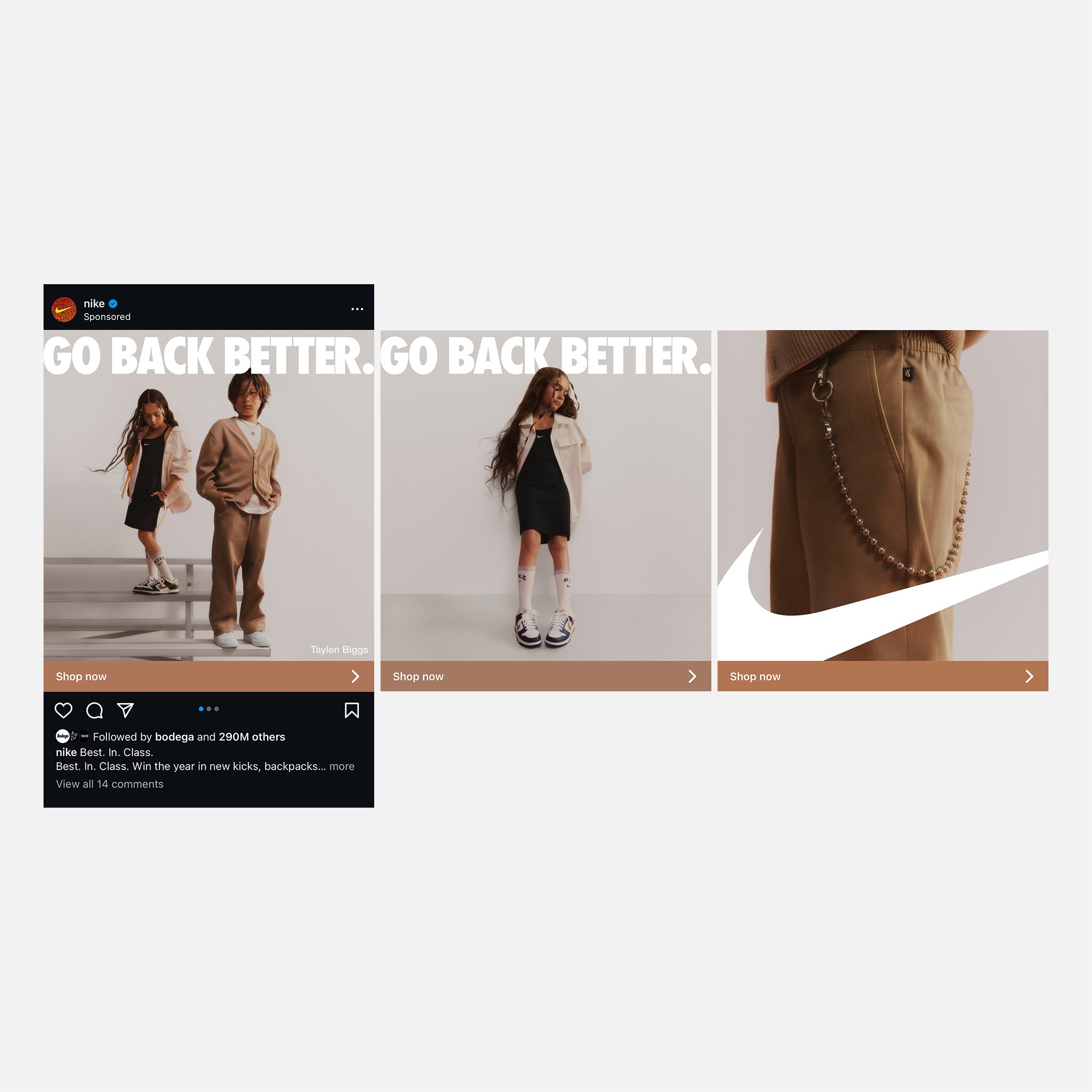
Nike Back to Sport mobile-app campaign execution.
Nike Back to Sport Nike.com campaign execution.
Nike Back to Sport integrated-media campaign execution.
Nike Swoosh scaling example within the Back to Sport system.

A closer look at the scale relationship between the lockup and the format across different touchpoints.

Reusable Components & Patterns

The system needed to be usable beyond the creative team. I built configurable Figma components for key campaign elements, giving other teams a faster way to create and adapt executions across formats. This helped scale the system while keeping the visual language consistent.

From System to Production

I partnered closely with the Art Director, copywriter, producer, and broader creative, marketing, and production teams throughout the campaign.

*Campaign materials have been omitted or obscured due to confidentiality. Happy to share more context on a chat.

The brand system  work across the entire consumer journey, from first impression to purchase. Before production began, I worked with the marketing team to map the key campaign moments and touchpoints and define what the campaign needed at each stage.

The brand system work across the entire consumer journey, from first impression to purchase. Before production began, I worked with the marketing team to map the key campaign moments and touchpoints and define what the campaign needed at each stage.

01 / 03

Bringing the System to Life

The system came together across Nike.com, app, email, and integrated media, adapting to each channel while maintaining a consistent Back to Sport expression.

Slide 1
.com
01 / 07

Come say hi.

Have a project, question, or just want to chat about typefaces? I’d love to hear from you.

© 2026 All rights reserved

THE GLYPH INDEX

Pilcrow Sign

AKA Paragraph mark

Come say hi.

Have a project, question, or just want to chat about typefaces? I’d love to hear from you.

© 2026 All rights reserved

THE GLYPH INDEX

Pilcrow Sign

AKA Paragraph mark

Come say hi.

Have a project, question, or just want to chat about typefaces? I’d love to hear from you.

THE GLYPH INDEX

Pilcrow Sign

AKA Paragraph mark